Posts Tagged ‘design’

Design Patents

Monday, November 26th, 2012

20121126-120941.jpg

Christopher Carani, Esq lectured on the importance of design intellectual property earlier this month at the Industrial Designers Society of America Chicago chapter at Beyond Design here in Chicago. His discussion was centered around an in-depth review of “Apple v Samsung” and how design patents took center stage in this case. Carani was very optimistic of the growing recognized value and power of design as evidenced by the legal trends he sees. Throughout the discussion Carani shared insights on how designers and businesses can best protect their UX design.

Highlights:

There is now a 700% increase in GUI filings in the US patent office in the last year.

Because of these types of cases and the rise of design patents businesses are being moved to avoid directing designers to “just copy” their leading competitor’s design. Comments were that Samsung has some very talented designers, perhaps now they will be able to design.

4 ways for designers to increase value

1 – Use broken lines and dotted lines (Broken lines may be used to show environment and boundaries that form no part of the claimed design)

2 – Use indeterminate break lines (The use of a separation and bracket to indicate that precise lengths are not claimed)

3 – Use multiple embodiments (form or scope) (As long as appearance and shape are similar)

4 – Show multiple applications (If there are minimal configuration differences)

Another point was the use of “flip book” type renderings to deal with the animations that GUI designs are more than ever innovating on.

There was a lot of discussion about prior art and the importance of that for enforcement and patent references. I think there are opportunities to combine this with a comparative analysis phase of projects in which designers make an inventory of preexisitng designs.

SEE ALSO

United States Patent And Trademark Office: A Guide to Filing A Design Patent Application

The Design of Design Patents, Part 4: Practical Advice for Designers

The Condiment Wars: Ketchup Innovation

Sunday, June 19th, 2011

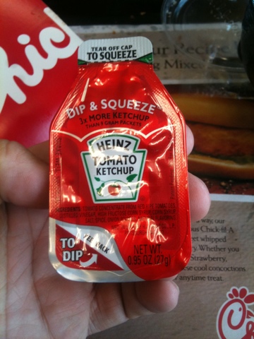
At Chick-fil-A yesterday in South Carolina I found these nifty ketchup tubes. You can “Tear and squeeze” or “Peel Back To Dip”. I tore and dipped.

I predict more mechanical application, injection, spraying, and mixing with condiments in the near future.

Starting in the late 90s pizza delivery started to include all kinds of spice packets so people could personalize and do their small part in “preparing” dinner for the family. Then and continuing a more recent phenomena is chefs brining attention to their food preparation as what makes them different and better than others chefs. They use equipment more often found on chemistry labs and “celebrate” the tools and techniques they use. These two trends lead me to see a near future of more innovation of condiment delivery than on another 20 different kinds of mustard which seems to be winding down. It will now be more on how the condiment is injected into or sprayed on or some other technique rather than on the actual ingredient.

References

Heinz Press Release
http://www.heinz.com/our-company/press-room/press-releases/press-release.aspx?ndmConfigId=1012072&newsId=20100204005923

Anthropology & UX Related Links

Thursday, July 2nd, 2009

Resources that are about anthropology and UX.

New Creative Order Emerges in Minneapolis – talks about

And a handful of younger shops with names such as Periscope and Olson that combine digital specialties with quirky offerings in design, packaging and even “social anthropology” are on the verge of lapping long-established, holding-company-backed agency brands in revenue.

Periscope – Check out their services page on Insight & Innovation, has ethnography. On their Talent section they have Heather Saucier, with background as Sociologist. Boo – no Business Anthropologist list.

Olson – Very light on the anthropology, but Social is there. No people listed at all, so no chance to see any anthropology background. It has a one sentence mention in their work section on Nike Bauer.

Out-of-the-box thinking is also being done in places such as Olson. The 180-person shop specializing in digital, for example, used a team of eight “social anthropologists” from places such as the London School of Economics to help Nike Bauer Hockey shake its perception as an older brand in a space dominated by youth. Olson mined hockey culture for insights into players’ language and aspirations — noting that youth hockey players are more influenced by older youth players than by the professional endorsers Nike typically employed. It also revamped the online retail experience. Bauer climbed to No. 1 from No. 3 in the category and has since been sold by Nike, which retained Olson to work on its Converse brand.

Ethnography and the Corporate Encounter: Reflections on Research in and of Corporations by Melissa Cefkin

Office Code: explores the impact of cultures upon office interaction and space planning

Mind the gap: ethnographers navigate the space between users and designers, start on page 40

Does Your UX Organization Chart look like this?

Tuesday, June 16th, 2009

An Organization Chart for UX and Interaction Design Groups

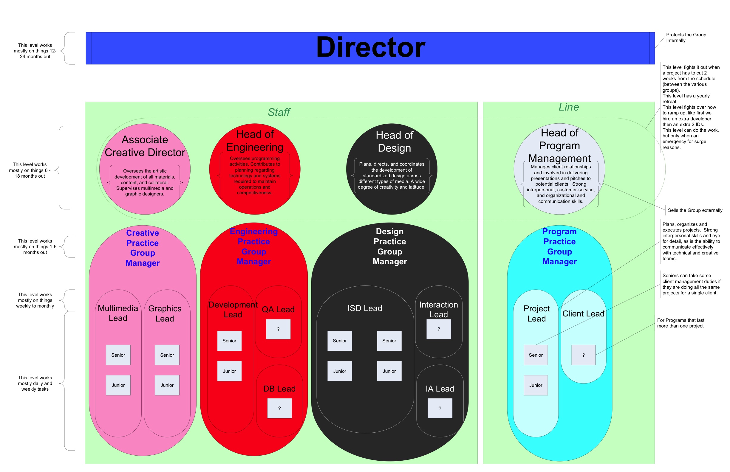
Not only do I like to design interaction for the internet, but also I like to design interaction for groups.  Here is a structural diagram for an interaction design department.

Click on image to see higher resolution & read the tiny text.

Visio-EdOrg_v4.0

If we are supposed to believe in the power of design and visual communication then why don’t we have more org charts like this one?

Both for ourselves and our departments we are a part of and for communicating who we are, what we do, and why it matters to other part of the company or even outside stakeholders or partners.

  • Along the left I show for each level in the organization the time horizon that those people should be concerned with.
  • In the center I have listed the major groups: Associate Creative Director, Head of Engineering, Head of Design, and Head of Program Management. Each of those groups have their various levels of Managers, Leads, Seniors, and Juniors.
  • Along the right side I have detailed out the responsibilities of each level and what types of decisions they should be making.
  • The other thing I like about this one is that it has more than just the design group, it’s about the ecosystem of roles, responsibilities, and relationships.
  • Note: ISD stands for Instructional Systems Designer.

What does your Interaction Design Org Chart Look like?

View Results

Loading ... Loading ...

An Interaction Design Org Chart like this is useful?

View Results

Loading ... Loading ...

Sketching out Typographic Study for “First Blood” Movie Poster

Thursday, May 21st, 2009

One of my project in a class I took was creating a movie poster.  I chose “First Blood” the 1982 action adventure movie with Sylvester Stallone as John Ramb, a Vietnam War veteran.img_07792 A great movie that harkens back to the Leatherstocking Tales of Natty Bumppo by American writer James Fenimore Cooper who wrote The Deerslayer and The Last of the Mohicans among others.

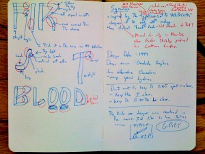
As you can see in the image I choose something inspired by the typefaces of the “Arts & Crafts” designers of the early 20th century. The Arts & Crafts movement tried to bring nature inside, into the home.  In the movie there is tension between the nature and civilized society represented by the town.  Rambo is of nature and he doesn’t seem to exist well “inside” society.Gustav Stickley produced his Craftman furniture in Syracuse New York.  This is near the area where the Leatherstocking Tales take place.  The contemporary type-house  who produces the typeface I choose is Woodside Graphics, which is located in the woods in the North West of the US.  That is very near the location where First Blood was filmed.

I like the “hand” look of the typeface which I think speaks to the way Rambo had to survive by things he made by hand, not with the fancy weapons those he fought against used. I like the bent wood look which speaks to the deep woods location the film. There are sharp aspects of the F that looked like two knife blades and Rambo’s most distinctive tool was a knife.