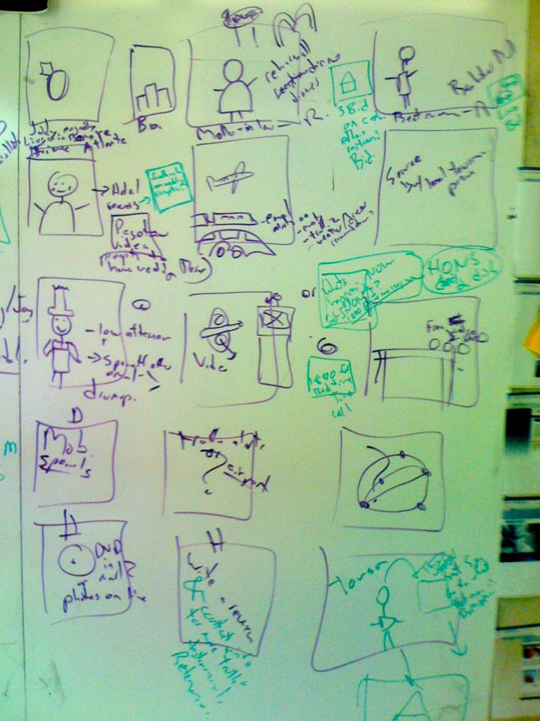
Here is a photo of a whiteboard storyboard sketch I worked on with Michael Blakesley and Haya Gaviola. We needed to show what the experience would be for someone as they planned and traveled to and from Baltimore. It has various modes of transportation. We needed to show real life, on-line, mobile, and even different actors. From this I suggest 3 things for making better Experience Storyboards
1. More People
This has people in it. I feel more comfortable building experience diagrams that have people in them. We are most often building these experiences for people, so why not put them in there.
2. Feelings in Thought Bubbles
And I don’t mean just goals. People (and personas) should have both Goals andFEELINGS. Too often we reduce people down to their utilitarian goals. In order to make sure you are having feelings, don’t focus so much on what people are saying, but what they are thinking – so there should be many “thought-bubbles” around people’s heads and not so many word bubbles.
3. Very Few Screnshots
Also notice, this has no screen shots in it of any interface. It is focused on the the person, not the interface.
I have a message out to Haya to see if she has a copy of the final version which is pretty sweet looking. If I get it I will post it here.
References
Example of Experience Storyboard by Geoff Alday
Example from Sun.com Customer Experience
Example Nate Ball’s Tunnel Experience
