Archive for May, 2009

Design Research: 5 Mistakes to Avoid

Friday, May 29th, 2009

I am not going to talk about Type I and II errors and stuff like that you can get from any ol’ research methods book.  These are hard won insights, lessons learned that over time have been hammered into my head. These come from hundreds of interviews and observations and by watching and talking with people.  These are the mistakes that can keep you from successfully “getting inside their heads.”

Mistake 1: Not thinking hard enough about sampling. This is the most important thing.  Especially if you have a number of “researchers” contributing.  You gotta think about who you are going to talk to or watch.

It is possible to get good results even if you have inexperienced interviewers.  It is possible to get good results even if you have the wrong questions.  But it is almost impossible to get good results if you aren’t asking the right people.

For good design research you gotta be talking to or watching the right people.  You mess this up and no matter how well you do with the rest of your plan, tasks, and design, well you might as well be making up your data.  Who knows, your made up data is probably better!

Mistake 2: Not doing any Pre-thinking.  If you don’t have a clue about the decisions your decision-makers have to make, then you aren’t giving them as much value as you could be.

Spend sometime talking with your clients, stake-holders, the people who are going to be taking your research and using it.  What are the decisions they are going to be making that you might be able to help collect data on.  If you have in mind the decisions down the road, it is much easier to set up your tables, your hypothesizes, and your null hypothesis before so as to use the time as a naturalistic experiment to help them in making their decision.  It is ten times harder to do this after the fact, and often impossible because of time constraints than it is if you set it up ahead of time.

If you can answer one or two or even god forbid three questions that stick in their craw you are rocking and rolling.  Pre-thinking your decisions leads to pre-thinking your analysis, leads to pre-thinking your data collection.  Pre-thinking is Good.

Mistake 3: Trying to be unbiased.  Don’t try to be a blank slate.  It is a waste of time.  I say “Don’t think about pink elephants”, and what jumps right into your minds-eye.  Yep, you got it those darn pink elephants.  Instead, work with what you know already.

Even if you aren’t a professional generalist you know something.  Or at least you think you know something.  Spell it out.  Write it down.  This is your initial bias.

A good anthropologist is not devoid of bias.  A common misperception is that a good anthropologist is someone who is devoid of bias, someone who has purged their system their brain, their thinking of bias. WRONG! a good anthropologist is AWARE of their biases and takes them into account.  It isn’t some relativist psycho-babble.

Keep a diary AND field notes.  Use your bias.  Become aware of things that excite you, piss you off.  I always say you know you are finding good stuff if strong emotions are involved.  Try to understand that YOU are the instrument.  You don’t have to go native or become like the people you study.  You are you, you aren’t trying to become them.  You are trying to understand them.  Use your built in radar of emotion to your advantage.

Mistake 4: Not connecting the Pictures Together Many times we focus so much at the mirco level of the customer that we don’t understand the clients macro-view.

Document the macro-system. What is it you are seeking to manage or predict. Seek to understand the system.  What are you making or saving? How does the system work? What makes it expand or contract.  What makes it go up or go down.

Build a functional model of the business side of things. Build a process model of the micro-customer side of things. Show the connections between the two.  The amount of insight you can generate for the business owners is immense and just doing this is sometimes worth the entire cost of the project. This helps makes your work easier to understand because you start from your client’s current understanding and build upon that.

You don’t want to dunk them into the cold water of a different world-view with nothing for them to hold onto.  You need to ease them “inside the head” of the customer. The cold hard fact is that they usually don’t care about the customer experience except for how it impinges in a functional sense on the business. So make it clear, make it easy, and connect the dots. It might not be the warm and fuzzies, but it will get clients very excited about the lives and world-views of their customers.

Mistake 5: Having More than Five Variables.  Ok, so here is an easy one.  Focus in on 5 conceptual variables.  Not less than 3. Not more than 5.

Usually we think that the more variables we are looking at, the more complicated the system and of course we want to covey the complexities of a customer’s world.  Unless you are doing extended fieldwork measured in months and years, stick to my advice.

Try to determine 5 different variables at the beginning of your work.  Code your data with those 5 variables.  These should drive down to operational definitions.  Don’t worry about scaling theme, likert-izing them. If you can show how one thing influences another thing and if it is a positive or negative influence you are a good way to building a powerful model of what your client wants to change.

At least one of these variables has to be the thing that the client or customer wants to change, influence, manage, or predict.  The other variables can be from the perspective of the informants.  But the operational definition better be understandable to the client.  Make sure to use these variables in your Big Pictures you build and it will all start to weave together in a coherent story.

To conclude, these are some of the things I have learned over my almost 20 years of investigations.  And it has taken me a long time to master them.  They are much more than methods, they are skills, and only through experience do you have any chance at getting better at them.  But it is a crap-shot at improvement if you don’t reflect on them.  I hope that if you haven’t thought about these before that on your next project you will and start  to hone your skills and get better at design research.  You shouldn’t be satisfied at just knowing a method, but you should hone your skills, better yourself, better your research, and better your results, and in turn better the design that comes out, and better the lives of the people who the design effects.  They are not methods or tricks, they’re how to reflect on your design research and how to skill lessons.  Once you understand and apply these to any design research problem you are investigating, uncovering customer insights becomes much easier.
Follow The Money: Easiest Way to Learn About Your Clients Business

Thursday, May 28th, 2009

How do they make their money?

Whatever client you are working on right now I want you to ask yourself “How do they make their money?” If you are working on someone’s website, especially a commercial venture, you better know how they (the business) makes their money.

I hope you are not out there organizing websites just because you like to have things organized.  Perhaps some people do this because they have a predilection to being obsessive compulsive, but it would be much better if we are getting paid for improving information architectures or bettering usability because of a need.

Far too often information architects have no idea of the answer to the money question. Yes, I will submit that money is a proxy for measuring success. But it is a easy business metric to gain client’s attention.  It is a good variable to pay attention to.  

It is a great variable to put into your “big picture” macro view.  If you can show how what you are doing or changing is going to affect the money that is a incredible thing.  That is a powerful thing.  If you can increase profits or decrease costs you will have all the C-level executives eating from your hand, and actually if this is true you probably should be a C-level executive.  

Now being able to have dollar “metrics” is the ideal that many people have written about.  The point of this article is not to go into that at all.  This article is about knowing your clients business! The said fact is that many people don’t even try to understand their clients’ business because they are thinking ahead to the difficultly of metrics and don’t want to go there.  In terms of knowing your clients’ business this is a cop-out.

In client conversations I love exploring what are some ways that they can make more money? Equally fascinating is what are ways they can save some money?

So, I ask you: How do they make their money?

Here are the basic elements of learning “How they make their money.”

  1. What do they obsessively count? Look in their annual reports, press releases, or even interviews with executives.  The numbers they tout. How do those relate to what is on the website.
  2. What is going to get them promoted, a big fat raise, or get them fired? Is their an easy way for them to measure or predict these from website metrics or traffic?
  3. What is the smallest unit they count?  What is the level of granularity they are looking at? Is it a single transaction or the lifetime value of a customer?  Is it sales or service and maintenance? Consider how the internet experience maps to these different granularities.
  4. If the website is focusing on increasing profits, consider savings.  If the website is focused on cutting costs also look at increasing revenue/profits.  Fiance is a combination of cost structure and revenue streams.

This concern about cost/revenue models isn’t going to transform you overnight into a financial consultant, and that is not the intent, but it is going to raise your appreciation of what the your clients’ world is like.  Knowing more about your client, their infrastructure and finances and what is important to them should be a first step of understanding the design challenge and will help you design a better solution that balances client needs and customer needs. This is true design thinking.

4 Keys to a Successful Web Presence: Push, Pull, Pass, & Punt

Tuesday, May 26th, 2009

Today, our team was just starting design on a new product idea. We are talking about different features and functionalities. There is so much possibility that we felt we were getting overwhelmed. One way I was taught to make sure I was covering all the bases of a successful web presence was the 4 Ps. So we went over the 4 P’s.

I learned the 4 P’s from Eric Bowe, a great internet strategic marketer I worked with at JWT, the marketing communications company. These 4 P’s are an easy way to make sure you have a robust internet experience for users. Different than those you ask yourself to focus on usability or to do a heuristic evaluation, these focus on the type of experiences you are supporting with your web presence. Ask yourself these 4 P’s as a quick gut check on your next internet project.

Push –  Email, SMS, RSS are good examples of where the organization has to “push” the messages to the users. This is great for personalized content and offers opportunities for tracking and analytics. Newsletters are a great tactic for Push. Understand that the compliance issues are extensive and you will need to spend time thinking through opt in and out and unsubscribing functions.

  • How is your message being pushed  to your users?
  • What are the answers your web presence has to users’ questions?
  • How are you tailoring to different needs?

Pull – The user has to seek out and “pull” the content to them. The normal website is the prime example. Blogs, like this one, are also pull. It better be useful, easy to get to, easy to consume, and timely.

  • What is it that brings people in?
  • How would people know that there is something “there” that they want and can get?
  • What is the message?
  • What is the stuff you are putting out there for the consumer to find?
  • And the most pertinent question after their first visit is why should they ever return again?

Pass – Viral. Tell-a-friend. Send an postcard to a friend. Perhaps it is the high score they achieved in a game on your site that they challenge a friend with. All of these have an “middle-man” pass a message along to someone else, indirectly. The advantage here is they know their friend and hopefully are sending to a friend who is interested in the topic.

  • How do you make it easy for a person to pass to another person information from your site, or a link?
  • What viral tactics are you using?
  • What aspect of your web-presence lends itself to word-of-mouth?

Punt – Fun. This is the combination of emotion and information. Entertainment and learning at best are one in the same.

  • How is your site fun?
  • More than easy to use, do they want to play with the interface?


References

Push & Pull Digital Marketing on Wikipedia

The usual textbook 4 P’s of Markting: Product, Price, Place (distribution), and Promotion.

Eric Bowe’s Blog

Sketch of Video Search Results Page: Crepe Search

Sunday, May 24th, 2009

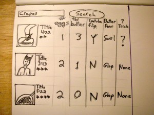
Video Search Results Page for Cooking Better Crepes
dscn20621This post is about searching within videos, not searching FOR videos.
This past week the wife was gone and the kids wanted me to learn to make crepes. I did and we had crepes 4 days in a row. Rotating through breakfast, lunch and dinner. I was very interested in finding different crepe recipes and figuring out different techniques to improve my skill.

When I started to search for different recipes I found many that were in video format.
MANY.
I watched them and tried to take note of how the chefs’ did things differently. Did they hold the pan above the stove when pouring or pour while the pan was on the heat? In what shape did they pour the batter – in one glop, in a circle. Where did they slide the crepe when it was filled with good stuff – to the center or side of the pan. These and many more questions intreged me.

The cuurent sesrch results and video players didn’t fit my need. What I really wanted were results that were both video and text. Or video that cut right to clip that showed the part I was interested in. OR even that I could play two or three videos next to each other and see side-by-side comparisons.

Video search right now seems to be dominated by an entertainment mentality. Even in the “how-to” space I feel each video is allowed to live on it’s own, to be judged on it’s own like a piece of artwork. There isn’t microcontent or a smaller level of granularity. What about using video (or better videos) to BUILD knowledge or expertise on something. I want the list of 100 videos to be showed in a matrix that I can split as I see fit. Perhaps even run some cross-tabs on. I would work in principle like the face recognition in iPhoto – you’d just have to identify one or two cases for it to use.
This is just a fun exploration of a video search that would help me come up with better crepes. I like the UI and how it allows me to compare information across the the different video cooking demos. I also like the ability of it to let me know that there is something new in a certain demo and that I might want to take a closer look, thought in terms of usability I don’t know how I would allow multiple videos to play at same time while keeping some of this result page information.

Global Navigation for World Domination

Thursday, May 21st, 2009

slide0023

The Battle-Plan for the Consumer’s Mind: Global Navigation

I am thoroughly enjoying reading “Card Sorting” by Donna Spencer and any one who want to call themself an IA or UX person had better read it.  And it got me thinking about how I use card sorting in helping to construct global navigation.

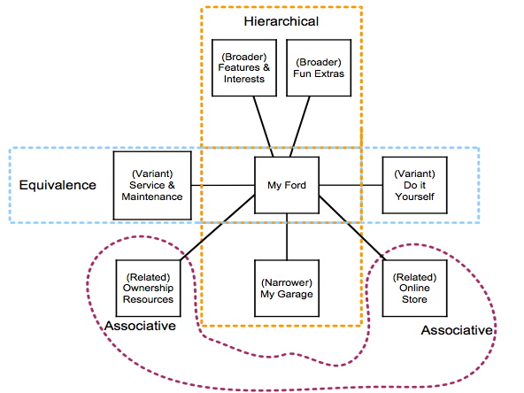
That is why I want to share the above diagram. The above diagram is what I call a T-Based Classification System.   T-Based means Thesaurus based. It used the cards sort, but isn’t the direct result of a card sort.

I first learned about Thesuarui when I served as a guinea pig for Samantha Bailey. She was doing some guest lectures and then doing a workshop at a conference and was working out some in-class projects for people to understand about thesauri, synonym rings, and controlled vocabularies.  I was hooked from then on.

The thing I loved about it was that it was a coherent system.  And that is what you you see above.  A coherent system.  Not just a bunch of words or labels.  But a “WHOLE” a system that makes sense with internal logic (and hopefully external logic to the real world.)

The above was and is the basis for the global navigation for MY FORD, which is now, almost 10 years later “Ford Owners Garage.”  If you go to the site today the global navigation has recently changed (as users and the context has changed), but you can still see the skeleton of the concept. That it lasted almost 10 years I think is testiment to how well thought out the original idea was.

In meeting with clients I always like to talk about Information Architectures as “The Battle Plans for the Consumers Mind.” And as such I want it to make sense to the consumer.  I want a consumer to look at a global navigation and get a good sense of the scope or breath of what they can find in that site, of the offerings of that company, division, or brand.  If not – then I haven’t done my job.

That is why global navigation is key. It is the key symbol of a brand.  That is why a company’s online presence is so important.  That global navigation should have weeks and months of thinking behind it.  It is the key synthesizing symbol for the product, company, or brand that that website is telling the story of. (Side note: Key Symbols is a very useful concept that comes from “On Key Symbols” 1973 by Sherry Ortner, one of my top 10 favorite articles of all time.)

I hope you see that your global navigation should be a well crafted and deliberate strategy, or as I put it battle-plan for the consumer’s mind. I would like to invite you to try to take the last global navigation you worked on (or perhaps you are working on) and try to fit it into my T-based classification system. Most importantly it might help you see categories that are missing. At the least it will give you another way to validate your global navigation.

Lastly, if you’d like to try it and send the results to me I’ll gladly look it over and offer suggestions.

And yes, this is how to validate your global navigation in regards to Commandment #10 from my earlier post.

Good luck!

References

Sherry Ortner, “On Key Symbols,” American Anthropologist 75 (1973), pp. 1338- 1346

Sketching out Typographic Study for “First Blood” Movie Poster

Thursday, May 21st, 2009

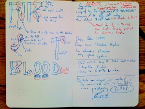
One of my project in a class I took was creating a movie poster.  I chose “First Blood” the 1982 action adventure movie with Sylvester Stallone as John Ramb, a Vietnam War veteran.img_07792 A great movie that harkens back to the Leatherstocking Tales of Natty Bumppo by American writer James Fenimore Cooper who wrote The Deerslayer and The Last of the Mohicans among others.
As you can see in the image I choose something inspired by the typefaces of the “Arts & Crafts” designers of the early 20th century. The Arts & Crafts movement tried to bring nature inside, into the home.  In the movie there is tension between the nature and civilized society represented by the town.  Rambo is of nature and he doesn’t seem to exist well “inside” society.Gustav Stickley produced his Craftman furniture in Syracuse New York.  This is near the area where the Leatherstocking Tales take place.  The contemporary type-house  who produces the typeface I choose is Woodside Graphics, which is located in the woods in the North West of the US.  That is very near the location where First Blood was filmed.

I like the “hand” look of the typeface which I think speaks to the way Rambo had to survive by things he made by hand, not with the fancy weapons those he fought against used. I like the bent wood look which speaks to the deep woods location the film. There are sharp aspects of the F that looked like two knife blades and Rambo’s most distinctive tool was a knife.

Three Questions To Ask Your UX Consultants

Tuesday, May 19th, 2009

Three questions your UX (User Experience) consultant better know the answers to!

UX consultants, be them Information Architects, Search Engine Optimization experts, User Experience Designers, Interaction Designers, or something else can be very important to the success of your product, service, and brand. You are paying them money. Sometimes very big money. How can you get more for your dollar?

To achieve the maximum return on your outlay, you must personally make sure your consultants can answer the following 3 QUESTIONS.

Here are 3 questions that you should ask your consultants every so often, or even better make them write up and give to you:

1. How does MY company make money?

Wow, what a powerful question. You want them to know how your company makes money, how it sustains itself, how it grows. You would be surprised how some UX consultants are not focused on the client’s business side of things. They spend an enormous amount of time, energy, and attention on the user side and don’t balance that with an equally sophisticated understanding of the business needs. It is YOUR FAULT if you let them come up with great ideas that customers like, but aren’t willing to pay for.

2. How are MY customers going to change over time?

This is not as easy. They usually are working from personas that you have given them or perhaps your consultants are researching and creating the personas as part of their deliverables. Do not see personas (or your customers) as permanently static bulls-eyes. People change. The situations change. You need to make sure your plan and design can change too. At the most simple level look at demographic changes, such as your 34 year old customer now in 7 years will be 41. What does that mean for the user experience? Those two age groups are very different, but it was the same person. How do you grow with them, or is the default plan to abandon them as you pay to acquire brand new customers.

3. What will get ME promoted?

Ok, this might seem a little selfish, but I can assure you that if your consultants know what it is that you are being measured on it can only be a good thing. Whether it is for your next promotion, a raise, or a bonus this kind of insight helps them in a micro way in the same way the first question helps them in a macro way. It might not be the focus of their current efforts, but their creative minds will work this over throughout the project and perhaps come up with some great ideas. If they see their fortunes and your fortunes as tied together, a rising tide raises all boats. What a testament to their success.

These questions and knowing their answers are about making sure you are getting the most value from your consultants. The answers change over time and sometimes quite often so at least at the start of every project refresh these mutual understandings and make sure that everyone has the same basic answers. It will help make your UX consultant more valuable and in the end help make your product/service and brand more valuable too.

Grape Crepe Plates & Social Media as Kanban system for optimizing organizational flows of information needs

Monday, May 18th, 2009

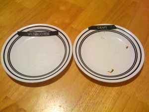
Tonight I made crepes for the kids.  Mom and away and so I figure this is a good time for me to experiment with some new dishes.  In the picture you can see two plates we used, a little dirty, that have labels that my one son printed out and attached to the top of the plates. img_07721 While I was busy making the crepes and giving them to the kids as fast as I could make them, they were eating them almost as fast.  My son would give me back the plate as they finished the crepes.  I would know exactly which kind they wanted more of. One plate was labled WUNBGCHESE and the other plate was labeled GRAPE. I made big cheese crepes and grape jelly crepes.  Beside the obvious work on spelling for ONE, BIG, and CHEESE,  I thought this is really ingenious.  It reminded me of the Just-in-time Kanban system. Wikipedia here and shorter/better article here.
Now, I have been doing a lot of thinking about social media and twitter and whether it is a push or pull type of system.  The crepe plates and kanban are both pull systems.  Inside of large organizations (like IBM) or an extended enterprises (like an Automotive Supply Chain) there might be a nice way to implement a “plate” that lets people know there is a needed update to certain kinds of information. Maybe social media mechanisms might be able to satisfy the 4 rules of implementing a pull system in terms of a Kanban system.

The 4 Rules are:

Rule 1 – Kanban works from upstream to downstream in the production process
My thought – So an report/answer would only be created when someone needs that information.  Reports that aren’t needed aren’t produced.

Rule 2 – The upstream processes only produce what has been withdrawn.
My thought – If information/reports are broken into appropriate levels of granularity – this might allow someone to only produce a update on those sections which were used/read/consumed.

Rule 3 – Only products that are 100 percent defect-free continue on through the production line.
My thought – Only reports/information that are “true” could go through. Quality and authenticity are the most important value.

Rule 4 – The number of kanban should be decreased over time.
My thought – The number of reports/information that gets worked on should be minimized over time because if something isn’t being used, it won’t get updated – reducing the breath of information following through organization but speeding up the smaller and more focused used kinds of information.

I guess I might call this “Social Media used as an Kanban system for optimizing organization flows of information needs.”

10 Commandments of Classification Scheme Analysis or How to make a darn good global nav

Saturday, May 16th, 2009

WARNING *** LIBRARY GEEK ALERT **** READING BELOW MIGHT AROUSE DESIRES TO WEAR HORN RIMMED GLASSES & PUT YOUR HAIR IN A BUN

Back when I started at Argus Associates I used to write up little cheat sheets for myself. I made one list of 10 things to help me review global navigations.  I am not sure if this is useful for anyone else, but I thought I would share. You have been warned it is on the super geeky side of of information architecture.

Much of this comes from cognitive anthropology and my reading of Sorting Things Out: Classification and Its Consequences by Geoffrey C Bowker and Susan Leigh Star.


10 Commandments of Classification Scheme Analysis

  1. There should be no need for multiple classifications.
  2. The granularity of terms must be appropriate across classifications.
  3. Cross-referencing must be obvious within a classification.
  4. The classification should not be based on just one audience.
  5. Labels for the same content should be the same.
  6. Vocabulary terms should clearly describe everything that is included under them.
  7. Make sure classifications include all necessary terms (comprehensive selection.)
  8. Beware the unlabeled covert categories. (These should be on your home page in an implicit way.)
  9. Act as if your are creating a thesaurus with your label choices.
  10. Your global navigation should have both hierarchical AND ASSOCIATIVE relationships. Hierarchy isn’t everything.

Visual Book notes for “Whatever you think, think the opposite” by Paul Arden

Thursday, May 14th, 2009

Whatever you think, think the opposite” by Paul Arden. He died just last month and at his website you can read many condolences and editorials.

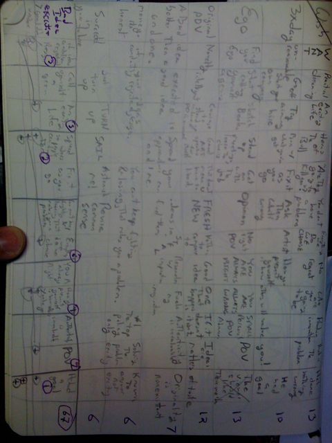
I think I take notes a little bit differently than other people. It seems to help me remember better.

In High School AP Biology class I took all my notes in a way similar to this and never had to study got an A and pretty much could recount word for word what the teacher said.

Now, with books like Arden’s I am not looking to get an A and there is no test.  My goal is to try to synthesize the book in a way so I can first understand it and then take action.

Below you can see my notes.  That is how I took them. The image is on it’s side. Along the bottom of the page you can see how I created a voting system, in which I wrote the most important idea from each column, then I did forced comparisons and decided between each adjoining pair, continuing that process until I came up with the most important idea from the entire book. Having it all on one page allows me to do decomposition and traceability through each of my decisions back to each individual idea from the book.  Kind of a gestalt view.

I don’t know if this would work for anyone else.  I would be most curious if anyone else out there takes notes in the manner.  It isn’t the Cornell Note Taking System, but it works for me.

In think also you can see the strong influence of a grid system. I have been talking alot with Todd Zaki Warfel of messagefirst fame about Grids and borrowing many grid books from his excellent library.