Archive for the ‘experience design’ Category

2nd Place at Hack the Museum at The Henry Ford

Wednesday, August 28th, 2013

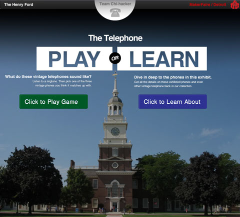
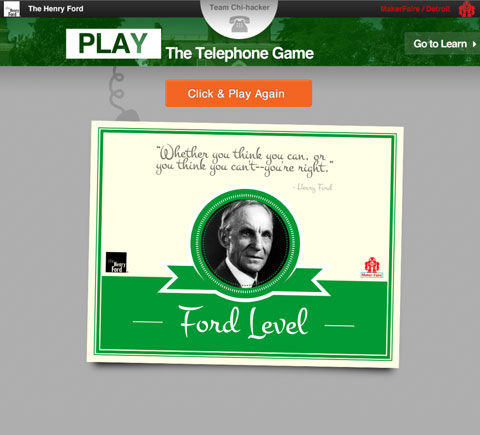
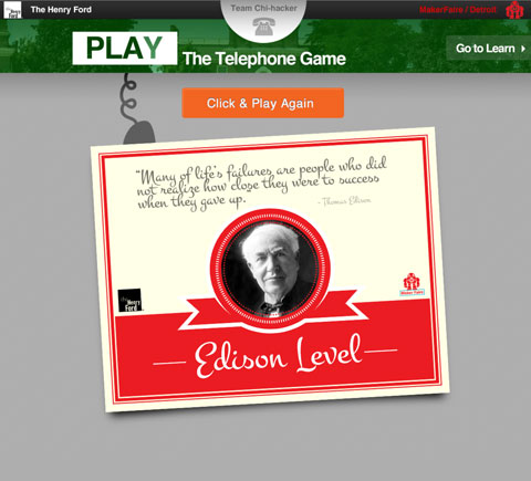
We won 2nd place in Hack The Museum last month. On Saturday July 27th Cody Greene, Jeff Molsen, Paul Kaiser and I competed in a Hackathon, Hack the Museum at The Henry Ford Museum in Dearborn Michigan. Below are some screen shots of the “telephone” game we made in ONE DAY! Yes, it worked, and yes we were tired.


hfm1

hfm4hfm3hfm2

hfm5 hfm6

 The Opportunity

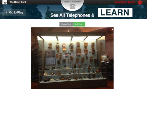
You know when you are looking at a big display case in a museum and you know they have more stuff in some back room but you can’t see it. Well our hack solves that and gives digital access to those objects. In addition we wanted to make it a fun experience, making it into a game. This game could be played pre-visit before someone comes to the museum or perhaps by kids on a kiosk while their parents are waiting in line to buy tickets.

The concept

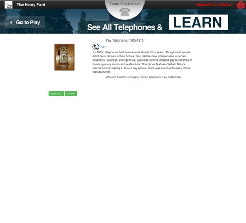
We blended the physical and the digital. We allow the visitor to reach back into the collections from an exhibit that they are looking at and interested in. Answering “What else might be in the basement or back room?” We also allowed the different sorting/arrangement of a collection be it by date which is different than how it’s ordered in the display. It is easier to resort, rearrange digital items quickly. Lastly, we made a game that flipped or pivoted how people approach the objects. Instead of the telephone first like you see in the display, we first played a sound, and then the person had to guess which telephone made that sound.

 Overall application design

We had access to many of the museum’s API, with the web API we  used java JAXB to parse and unmarshall the results from xml to java which we used in our JSPs to display the results. We  used java xjc to generate java classes that are analogs to the xml schema and when we unmarshall the results from calling the web service those java classes are what get populated. We used APACHE HTTP client API communicating with the web service.

References

Official Hack the Museum Site at Maker Faire Detroit

Blog Article about the Hacking The Henry Ford (The Henry Ford Official Blog)

Deadline Detroit article highlighting the 1st place winner

Cody Greene

Jeff Molsen

Paul Kaiser


Gamification with fruitbuddi

Wednesday, July 25th, 2012

Last week I had the pleasure of skyping with Taylor Reynolds and Brandon Rivera-Melo of fruitbuddi about gamification. fruitbuddi is a product to “enable children to make healthy decisions in the grocery store.”

To direct the conversation we used the conceptual framework for gamification. It  helped  structure a critique of the fruitbuddi and exposed some gamification experience opportunities. The most interesting ones came out of considering the different levels of players and the social learning aspects of how different aged children and families might use the fruitbuddi and learn how to use it better as individual players moved from novice, to problem solvers, to masters.

We talked also about the behavioral onramps that exist in the kitchen or dinning areas that might reference and prime the anticipated use or recollections of using the fruitbuddi in the store. Taylor and Brandon asked about internal/external motivation. That isn’t in the framework. I purposely left it out. In the framework there are “positive emotion” loops that come from players trying to move to the next player level through the challenges. The loops are explicit, but the resulting positive emotion concepts are not. That is a weakness of the current framework that I need to fix and clarify. The discussion about how to embed more positive emotions into any (even minor) action/activity the players take did yield some more possible enhancements.

Overall the conceptual framework was useful for looking at a experience and having a structured dialog about how it could be gamified.

References

fruitbuddi

Thank you to Sami Nerenberg, Director of Operations at Design for American for putting fruitbuddi in touch with me.

Trash Can Fail

Thursday, May 3rd, 2012

Look at the bag of trash right in front of this trash can. What went wrong? Why isn’t it IN the trash can? This trash can failed. It’s interesting that the bag is on the ground in front of the open small hole recycling slots rather than in front of the large slot. Someone might have tried to put it into the small slot of the recycle side and gave up after it didn’t fit and never “saw” the large slot for regular trash.

20120503-053832.jpg

There are signage issues that might confuse. See how the regular trash signage shows someone easily dumping trash while in reality someone must pull open and down the drawer. Many people carry a bag with one hand and have the trash item in the other hand making it difficult to use this trash can.

20120503-064441.jpg

Here you can see how much better the recycle openings and instructions are.
20120503-064516.jpg

Experience Design (UX) & Experience Points (XP), like peanut butter and chocolate

Monday, January 16th, 2012

User experience designers should look “experience points”, a gamification concept, to help them build and design better experience.

Experience points, of the different types of point systems in game design and gamification, are the most important element in a gamification framework.

Experience points are how you watch, rank, and guide your player. This gets to the heart of experience design and user centered thinking.

A good exercise would be to go through your webpages and assign experience points to every activity you want users to engage in. This way you make it explicit how important each is in relation to other actions across your entire web presence. This forces you to look at experience design above the level of page design.

See also

Prof Subs Grades for Experience Points

Reward Systems that Drive Engagement

Sketching & merchandising expensive jewelry

Thursday, January 5th, 2012

Look at how this store sells people by merchandising sketches of the product. Emotive and personal, conveying a different attitude than just a product image might.

20120105-182801.jpg

The Condiment Wars: Ketchup Innovation

Sunday, June 19th, 2011

At Chick-fil-A yesterday in South Carolina I found these nifty ketchup tubes. You can “Tear and squeeze” or “Peel Back To Dip”. I tore and dipped.

I predict more mechanical application, injection, spraying, and mixing with condiments in the near future.

Starting in the late 90s pizza delivery started to include all kinds of spice packets so people could personalize and do their small part in “preparing” dinner for the family. Then and continuing a more recent phenomena is chefs brining attention to their food preparation as what makes them different and better than others chefs. They use equipment more often found on chemistry labs and “celebrate” the tools and techniques they use. These two trends lead me to see a near future of more innovation of condiment delivery than on another 20 different kinds of mustard which seems to be winding down. It will now be more on how the condiment is injected into or sprayed on or some other technique rather than on the actual ingredient.

References

Heinz Press Release
http://www.heinz.com/our-company/press-room/press-releases/press-release.aspx?ndmConfigId=1012072&newsId=20100204005923

Brand to Customer Loyalty

Friday, February 25th, 2011

How could companies be loyal to their customers? Call it “Brand-to-customer Loyalty.”

“Brick and Mortar Loyalty has meant customer loyalty to brick and Mortar, it has never had to mean brick and mortar loyal to consumer” – Chris Hall

Loyalty is shorthand for repeat usage and also an element of having a relationship

Loyalty in the sense of the business “celebrating” that they know the customer. Perhaps even giving them precedence over a new customer.
Loyalty might mean giving them special rights that new customers might not have such as a discount based on number of years as customer.

Loyal Customers are Happy Customers

One way to make happy customers might be to be “loyal” to customers.  I know we usually think about customers being loyal to a company or to a brand.  What would it mean if a brand was loyal to a customer?

A real world example at our local Mexican Grocery Store

They know us. We know them.  Not just the cashiers. I mean, the cashiers, the owners, the cooks in the back and the waitress who serves us in the small little restaurant. They have even offered to extend us a line of credit. Allow us to open an account that we could pay each month.

Loyalty to us: Around the Christmas holiday they gave us a bag of treats. Not just a calendar, but some sodas, some chips, and some cookies, and some .  Now we aren’t talking big bucks. But that was nice. And they weren’t giving it out to everyone.  I liked that. Made me feel special and I could see they didn’t have a pile of pre-made bags with all the same items that they gave to each person.


See Also

Transform Your Loyalty Program from Bank to Park

Happy Customer


Happy Customers and “The Curse of Knowledge”

Friday, December 31st, 2010

Right now I am preparing a workshop to help a client who builds and sells physical products. We are helping them create a “device management” interface for one of their products. They want to make sure they will have happy customers.

Why do companies bring me in to help them? They are experts in their products. Why do they need our services to help ensure they will have happy customers?

Because of “The Curse of Knowledge.” Bob Sutton uses this concept to explain how to be a better manager, but I think it is valid for us to think about why clients need to hire or bring in experience designers.

“The Curse of Knowledge” as he explains it is “the more people know about something, the harder it is for them to package explanations and instructions in ways that others can comprehend.” In terms of customer experience and thinking about happy customers, this curse happens because experts, the companies and their employees, have a hard time putting themselves in the shoes of their customers. More important than happy customers, is being able to put themselves into the shoes of an unhappy customer or a first-time customer.

How can they “forget” their expertise and design an interface that embody simple tasks that allow their customers need to do.  Simple means simple to know and simple to do.  It should require minimum emotional and cognitive effort to turn what knowledge and needs the customer has into action.

I am using my business and industrial anthropology background to help this company see their own product in new ways, most importantly in the way their customer or a first time user of their product sees their product. It is like explaining the culture of a distant tribe to a group of people. More apropos than “explaining” is “translating.” One needs not only to be good at understanding their foreign tribe – the customer. But also to understand the client culture. Then figure out ways to translate the customer world-view into the client world-view.

References

Bob Sutton on “The Curse of Knowledge”

Measuring Happiness in Usability Testing

Tuesday, December 21st, 2010

Yes, you want happy customers. How in a usability test can you evaluate if your prototype experience fits together with a happy customer.

Tomorrow at Red Privet we are doing a round of usability testing. More/Better happiness is a valid and useful goal for software/service design. How can happiness be measured in a usability test?

In earlier work with the end-users we were able to map the experience in the image below. In the bottom half of the image you can see the ups and downs of error/problems as the end user would go through the stages of the journey.  Then we asked the end user to put a smiley face on the the stage they were most happy at and a frown on the stage they were most sad at. In a similar way, I’ll ask “What part of the prototype that you just used was the most satisfying?” OR “What would be the high point and the low point of using the tools that we just went through?”

See Also

Beyond Frustration: Three Levels of Happy Design

How to improve a wireframe/prototype review session.

Wednesday, December 15th, 2010

Before you even start the review ask 3 questions.

  1. What kind of feedback would be most helpful for you, the designer, at this point?
  2. Do we all (anyone who is in the review session) understand the opportunity/problem? Don’t begin critiquing until everyone understands the opportunity or problem that it is addressing.
  3. At what stage is this review? Idea, Middle, or Final.

Then based on those answers ask the appropriate questions from one of the 3 sections below.

Idea sketch/stage?

  1. What job does this page do?
  2. What do you want someone to do after this page? Where do they go?
  3. What is the user’s goal on this page?

Middle Iteration Stage?

  1. What is the one thing on the page that generates the most value for the user? . . . for the business? How can you combine them?
  2. What can you make automatic? What do you know about the user so that they don’t have to think as much?
  3. Does the page pass the Push/Pull/Pass/Punt test?

Final Polishing Stage

  1. What can you remove? (Simplicity)
  2. How can you make “units” look more unified? Are the things that should be close together as close together as they can be? Are likely comparisons right next to each other?
  3. How can you enhance the one action/link that you most want people to use

See Also

4 Keys to a Successful Web Presence: Push, Pull, Pass, & Punt

My notes from The Laws of Simplicity by Maeda

How to Review Wireframes (one resource I was able to find that also addressed this topic)

UX 101: The Wireframe

Wireframe Checklist

Silent Choice of Click – Show everyone the first page of the wireframes. Ask each attendee to decide, silently, where their persona would click. Then discuss the choices and anything else you feel like discussing on that page.