Happy Customers and “The Curse of Knowledge”

December 31st, 2010

Right now I am preparing a workshop to help a client who builds and sells physical products. We are helping them create a “device management” interface for one of their products. They want to make sure they will have happy customers.

Why do companies bring me in to help them? They are experts in their products. Why do they need our services to help ensure they will have happy customers?

Because of “The Curse of Knowledge.” Bob Sutton uses this concept to explain how to be a better manager, but I think it is valid for us to think about why clients need to hire or bring in experience designers.

“The Curse of Knowledge” as he explains it is “the more people know about something, the harder it is for them to package explanations and instructions in ways that others can comprehend.” In terms of customer experience and thinking about happy customers, this curse happens because experts, the companies and their employees, have a hard time putting themselves in the shoes of their customers. More important than happy customers, is being able to put themselves into the shoes of an unhappy customer or a first-time customer.

How can they “forget” their expertise and design an interface that embody simple tasks that allow their customers need to do.  Simple means simple to know and simple to do.  It should require minimum emotional and cognitive effort to turn what knowledge and needs the customer has into action.

I am using my business and industrial anthropology background to help this company see their own product in new ways, most importantly in the way their customer or a first time user of their product sees their product. It is like explaining the culture of a distant tribe to a group of people. More apropos than “explaining” is “translating.” One needs not only to be good at understanding their foreign tribe – the customer. But also to understand the client culture. Then figure out ways to translate the customer world-view into the client world-view.

References

Bob Sutton on “The Curse of Knowledge”

Measuring Happiness in Usability Testing

December 21st, 2010

Yes, you want happy customers. How in a usability test can you evaluate if your prototype experience fits together with a happy customer.

Tomorrow at Red Privet we are doing a round of usability testing. More/Better happiness is a valid and useful goal for software/service design. How can happiness be measured in a usability test?

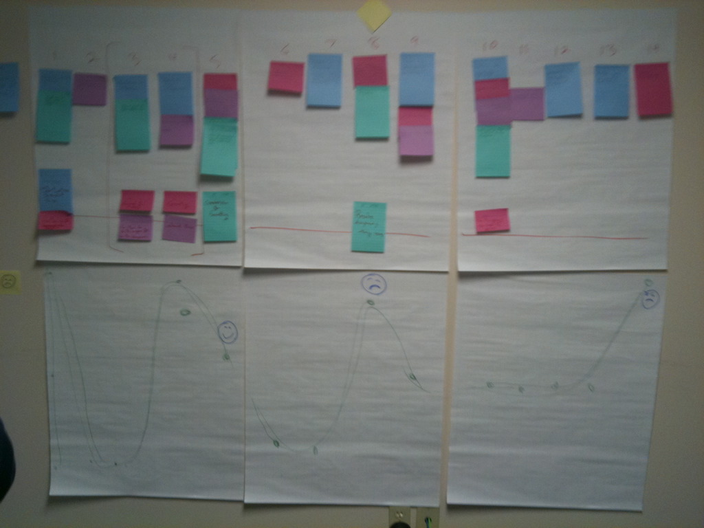
In earlier work with the end-users we were able to map the experience in the image below. In the bottom half of the image you can see the ups and downs of error/problems as the end user would go through the stages of the journey.  Then we asked the end user to put a smiley face on the the stage they were most happy at and a frown on the stage they were most sad at. In a similar way, I’ll ask “What part of the prototype that you just used was the most satisfying?” OR “What would be the high point and the low point of using the tools that we just went through?”

See Also

Beyond Frustration: Three Levels of Happy Design

Notes on “In Pursuit of the Perfect Brainstorm”

December 20th, 2010

Notes on “In Pursuit of the Perfect Brainstorm” by David Segal NYT Dec 16, 2010

“. . . its specialty is conceiving new businesses and what it sells is really the art of innovation.”

“America has gone meta – it has started thinking about thinking. And all that thinking has led many executives to the same conclusion: We need help thinking.”

“… without the right atmospheric mix, no brainstorming session will produce the cognitive version of lightning”

“… traditional brainstorming can devolve into a kind of competitive idea tennis.”

“ … improve theater . . ‘Yes, and?’ … what was once a contest is transformed into a group exercise in storytelling. It has turned into a collaboration.”

“ … strategy isn’t about stability, it’s about change.”

“For years, the good manager was one who had data at their fingertips … By the early ‘90s, though, companies like Microsoft and SAP were selling software that digitized this task … Suddenly it’s about leadership, creativity, vision.”

Reference

In Pursuit of the Perfect Brainstorm

How to improve a wireframe/prototype review session.

December 15th, 2010

Before you even start the review ask 3 questions.

  1. What kind of feedback would be most helpful for you, the designer, at this point?
  2. Do we all (anyone who is in the review session) understand the opportunity/problem? Don’t begin critiquing until everyone understands the opportunity or problem that it is addressing.
  3. At what stage is this review? Idea, Middle, or Final.

Then based on those answers ask the appropriate questions from one of the 3 sections below.

Idea sketch/stage?

  1. What job does this page do?
  2. What do you want someone to do after this page? Where do they go?
  3. What is the user’s goal on this page?

Middle Iteration Stage?

  1. What is the one thing on the page that generates the most value for the user? . . . for the business? How can you combine them?
  2. What can you make automatic? What do you know about the user so that they don’t have to think as much?
  3. Does the page pass the Push/Pull/Pass/Punt test?

Final Polishing Stage

  1. What can you remove? (Simplicity)
  2. How can you make “units” look more unified? Are the things that should be close together as close together as they can be? Are likely comparisons right next to each other?
  3. How can you enhance the one action/link that you most want people to use

See Also

4 Keys to a Successful Web Presence: Push, Pull, Pass, & Punt

My notes from The Laws of Simplicity by Maeda

How to Review Wireframes (one resource I was able to find that also addressed this topic)

UX 101: The Wireframe

Wireframe Checklist

Silent Choice of Click – Show everyone the first page of the wireframes. Ask each attendee to decide, silently, where their persona would click. Then discuss the choices and anything else you feel like discussing on that page.

Nice Placement: “floor ads” located on waiting spaces : Ambient marketing and merchandising using “opportunity” spaces

December 13th, 2010

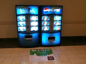
In the Park City Mall this weekend I saw a “floor ad” that was in front of some vending machines.

These ads seem to be located throughout in the mall in front of spaces that people would be standing and waiting. The Pepsi one might be considered POS (Point of Sale) merchandising, but the elevator isn’t.

Floor ads aren’t new, but I thought the placement of the elevator ad was perfect. The location of ambient marketing floor ads becomes more important than if it it POS which is based on the product and put on the floor using the rule of thumb that people look where they are walking.  Ambient marketing needs to consider where the “opportunity” spaces and times are and put placements there.

Reflections

  • Possible Improvement – QR codes for follow on information and feedback.
  • Possible Enhancement – Pair smartphone feedback with more interactive floor display like by EyeStep (ambient retail marketing)
  • Possible Risk – the ad itself could get torn/broken since it is in a high traffic pathway and of course the risk of the technology not working.

Related Posts

Part 2: Visual Merchandising: Storefront Window Displays & Online Promos

See Also

Advertising; Fruit to Walls to Floor, Ads Are on the March – This article from NYT “98 talked about it, but most of those ads (excepting the bathroom one) didn’t seem to take advantage of the “waiting” time/space opportunity that the elevator examples does.

Floor Ads Company

Raising the Roof with Floor Ads

When Social Objects meet “The Mesh”

December 2nd, 2010

“The Mesh” is mostly about physical (owned) objects that get shared. Social objects are objects that act as social “glue” between people.

I see the start of really powerful experiences when these two things are brought together. In Lisa Gansky’s book she gives that example of the Zip Car named “Mini Mucho” which is a example of a mesh object that is also a social object.

Social Object transformed into Mesh

Look at how social objects can be transformed into mesh objects (through time-sharing, such as a pet dog that gets rotated around a couple different families). What are all the ways we can time-split an object or place usage, such as a bank that during evening hours could be used for community gatherings? Or the use of corporate offices during the weekend for unconferences and barcamps.

Mesh Objects given an opportunity to build social meaning

How can mesh objects be given the opportunity to become social objects (through functions such as naming, tagging, graffiti, etc)? What are the ways we can use QR codes to give a “guest book” like quality to objects that get past around. For the tool library example – how about a list of all the projects that that tool helped to build (birdhouses, tree houses, book shelves, etc.)

References

The Mesh: Why the Future of Business is Sharing by Lisa Gansky (Thank you Mr Simborg for turning me on to this read.)

Social Mania: Designing Social Interfaces

The Missing Piece of the Semantic Web – The Social Browser

Bodystorming explained in visual diagram

November 10th, 2010

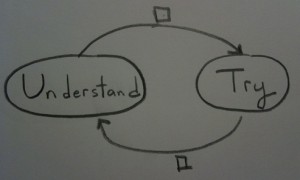
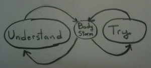
Marc Rettig visually explains his “process” as understand and try with prototypes between them.

Bodystorming can thus be explained by extension as focusing on the “prototypes” or bodystorms as the central element of understanding and trying.

See Also

Prototyping at the Systems Level

Social Media Black Out Experiment at HU

November 3rd, 2010

Monday night I went to New Tech Meetup of Central PA and saw a presentation by Charles Palmer of Harrisburg University on a week long “social media blackout” experiment they recently did.

Interesting Points:

  • Only about 15% of the students abstained which I thought was a low number.
  • Some students did get the “Facebook twitch” and “cheated” by walking down the street to siphon off hotel wireless.
  • Students talked about wanting to “know what’s going on outside the building.”
  • Students stayed in the hallways talking to one another, which I guess they don’t need to do if they are on their social media sites (but it seems that these FTF connections are not the ones they are seeking in the earlier comment about knowing what’s going on outside the building.)

What I find interesting from the above comments and observations is seeing how space/place use is connected to  social media use.  This calls to mind some earlier work on Placemaking Presentation done at Miami IA Summit 2008 that was during the start of the social media explosion.

Does social media technology change how architects construct the spaces we live and work in? Do we need less hallways spaces? Do we need less windows?

My notes from 33: understanding change & the change in understanding by Richard Saul Wurman

October 24th, 2010

My notes from 33: understanding change & the change in understanding by Richard Saul Wurman

4 Sentence Summary

Articulate what you really need – describe the performance needed from a person or product to solve the problem. Learn more by understanding more through asking “how something performs.” Build a model with the intent of making constructive demands for an improved better-working environment. Designing your life is the big design problem.

Five Star Ideas

(p15)
By organizing information, he said proudly, you create new information.  Nothing has changed; you’re still the same people. And that’s the same with everything else in life.

(p15)
If you don’t ask, you don’t get . . . all of it pointed in one direction: Learning.

(p17)
You don’t remember something you haven’t learned and if you’re not interested, you don’t remember; therefore, you don’t learn . . . as courses did not come from a wellspring of interests of those being taught.”

(p17)
“Now, as I said, everybody’s got a pretty good idea of what the problems are, and they’re certainly not shy about telling you.  But the difficultly seems to be that nobody really knows how to say what the real problems are. It’s as though there are only two words in everyone’s  vocabulary:  the word “No” and the word “More.”

(p20)
Innovation, creativity and invention are about what! How I do something is design.

(p20)
We have the problems and we have the questions, but the only questions we seem ever to ask are the ones that can be answered “more” or the ones that can be answered “no.” So, if you look at it that way, you could say that first of all, we don’t know what our problems really are. We don’t know how to articulate what we really need.  We don’t know how to describe the performance we need from a person or a product to solve the problem. We don’t know, in other words, how to make the constructive demands for an improved, better-working environment.

(p22)
We live in fear of our ignorance being discovered and spend our lives trying to put one over on the world.  If we instead could delight in our ignorance, use it as an inspiration to learn instead of an embarrassment to conceal, there would be no information anxiety!

(p29-30)
…they could begin to concentrate instead on communication drawings which conveyed real information about how physical spaces would perform and feel.

(p31)
…once people began to realize that if they were going to do anything about the world they lived in, they were going to have to learn about it.

(p32)
“I am never content until I have constructed a model of the subject I am studying. If I succeed in making one, I understand; otherwise I do not.” – William Thompson

(p34)
“Most things don’t work and if you don’t ask, you don’t get.” –RSW

(p37)
I love technology . . . I choose my assistants well and I know creative thoughts come from me and not my tools.

(p39)
Design wasn’t a problem or a challenge; it was a way of life … the big design problem is not designing a house … it’s designing your life.

(p40)
Do good work … the ultimate is to do good work and that’s all we try to do.

(p41)
Ask someone to talk for an hour, they’ll do it right away. Ask someone to talk for five minutes, it will take them months to prepare.

(p43)
Hailing failing will get you where you need to be! Hailing, failing yet still sailing was, in fact his motto.

(p46)
So much useful and productive activity, so many good ideas, so many conceptual breakthroughs, had come about as the result of the strange embrace between the so-called creative person and his experience with and reactions to failure.

(p50)
The disease of looking good is confusing aesthetics with performance . . . the cure: ask how something performs!

(p51)
Administrativitis: This disease . . .  where the individuals think they are running the system but in actuality just he opposite is the case . . .  is characterized by a preoccupation with the details of the operation – administrative issues, salaries, square footage, supplies – and a neglect of the purposes for operation.

See Also

Goal Setting and Richard Saul Wurman
Better Bodystorming Quick Tip: Televiewer = large paper w/ hole in it

October 23rd, 2010

If you need to show someone interacting with someone else on a “display” just take a large piece of paper and rip a big hole in it. Here is a good example of a “televiewer” that one student is getting help with homework from another student.