Archive for the ‘Uncategorized’ Category

“Convergence” – Why we aren’t even close to the potential.

Monday, June 1st, 2009

For all the talk about convergence and all the lip service that most telecoms give to the idea I don’t see any result.

A person getting their phone bill, cable TV bill, and Internet service bill all in one is NOT convergence.  Perhaps from the POV of the company, but not from the perspective of the consumer.

The only application I consider right now to be delivering on some element of convergence is Visual Voicemail on the iPhone.  That integrates the voice phone and my contact’s information.

What we need to do is allow people to pivot of two different points.  An example is voice and text like with Visual Voicemail. Another is the two points of entertainment and communication, where a number of companies are trying to innovate, such as to allow people to “watch” a TV show together even though they are in different physical locations.  Commenting and sharing communications with each other while consuming a television show. Or with recommendation systems like Netflix but truly integrated into your set-top box.


5 Reasons Why Convergence Is A Bust (so far).

  1. Stove Pipes
    Most of these big companies are organized into stove pipe and the cable division doesn’t like the Internet division which distastes the phone division.  Who wins – not the consumer, because these little battles keep companies form coming together for the sake and benefit of the consumer.
  2. The Pipe and the Piped
    The industries are still thinking like they are separate – the pipe and the piped are separate.  That was done because of distribution and production challenges that existed in the past and now are very different. Those companies that combine the two are the ones who can move fastest in the space – watch them closely.
  3. Messier World
    Combining these things makes it a very messy world.  Companies and VCs like to keep this stuff easy to measure, easy to track, when we start combining it all together how do we count things for media buys and market segmentation. That messiness is scary, but it’s real, and its only going to continue to happen.
  4. Losing Control
    It is not about just combining two concept, but combining two actor networks.  The business and the consumer.  Some control is now flowing to the consumer and that is something that is also scary.  But again, it is happening, get over it and get on-board.
  5. What People Actually Do
    This is the most important point, because here companies are still too focused on what people SAY they want. I too like to listen to people, but with my anthropological training I know I need to SEE what they are actually doing.  (Just like many times what people say they do and what they actually do are different.) Entertainment consumption is often about identity and managing that is an active yet subtle practice for people.  I want to build things that aren’t just easy to use, or what people TELL us they want, but things that people will use and want to use.

Why do YOU think Convergence is a Bust

View Results

Loading ... Loading ...

Acknowledgements:
I want to thank Peter Van Dijck  for a great conversation last night that inspired me to post this.  Any errors in this post are, of course, my own.
4 Keys to a Successful Web Presence: Push, Pull, Pass, & Punt

Tuesday, May 26th, 2009

Today, our team was just starting design on a new product idea. We are talking about different features and functionalities. There is so much possibility that we felt we were getting overwhelmed. One way I was taught to make sure I was covering all the bases of a successful web presence was the 4 Ps. So we went over the 4 P’s.

I learned the 4 P’s from Eric Bowe, a great internet strategic marketer I worked with at JWT, the marketing communications company. These 4 P’s are an easy way to make sure you have a robust internet experience for users. Different than those you ask yourself to focus on usability or to do a heuristic evaluation, these focus on the type of experiences you are supporting with your web presence. Ask yourself these 4 P’s as a quick gut check on your next internet project.

Push –  Email, SMS, RSS are good examples of where the organization has to “push” the messages to the users. This is great for personalized content and offers opportunities for tracking and analytics. Newsletters are a great tactic for Push. Understand that the compliance issues are extensive and you will need to spend time thinking through opt in and out and unsubscribing functions.

  • How is your message being pushed  to your users?
  • What are the answers your web presence has to users’ questions?
  • How are you tailoring to different needs?

Pull – The user has to seek out and “pull” the content to them. The normal website is the prime example. Blogs, like this one, are also pull. It better be useful, easy to get to, easy to consume, and timely.

  • What is it that brings people in?
  • How would people know that there is something “there” that they want and can get?
  • What is the message?
  • What is the stuff you are putting out there for the consumer to find?
  • And the most pertinent question after their first visit is why should they ever return again?

Pass – Viral. Tell-a-friend. Send an postcard to a friend. Perhaps it is the high score they achieved in a game on your site that they challenge a friend with. All of these have an “middle-man” pass a message along to someone else, indirectly. The advantage here is they know their friend and hopefully are sending to a friend who is interested in the topic.

  • How do you make it easy for a person to pass to another person information from your site, or a link?
  • What viral tactics are you using?
  • What aspect of your web-presence lends itself to word-of-mouth?

Punt – Fun. This is the combination of emotion and information. Entertainment and learning at best are one in the same.

  • How is your site fun?
  • More than easy to use, do they want to play with the interface?


References

Push & Pull Digital Marketing on Wikipedia

The usual textbook 4 P’s of Markting: Product, Price, Place (distribution), and Promotion.

Eric Bowe’s Blog

Sketch of Video Search Results Page: Crepe Search

Sunday, May 24th, 2009

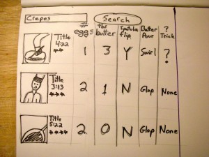
Video Search Results Page for Cooking Better Crepes
dscn20621This post is about searching within videos, not searching FOR videos.
This past week the wife was gone and the kids wanted me to learn to make crepes. I did and we had crepes 4 days in a row. Rotating through breakfast, lunch and dinner. I was very interested in finding different crepe recipes and figuring out different techniques to improve my skill.

When I started to search for different recipes I found many that were in video format.
MANY.
I watched them and tried to take note of how the chefs’ did things differently. Did they hold the pan above the stove when pouring or pour while the pan was on the heat? In what shape did they pour the batter – in one glop, in a circle. Where did they slide the crepe when it was filled with good stuff – to the center or side of the pan. These and many more questions intreged me.

The cuurent sesrch results and video players didn’t fit my need. What I really wanted were results that were both video and text. Or video that cut right to clip that showed the part I was interested in. OR even that I could play two or three videos next to each other and see side-by-side comparisons.

Video search right now seems to be dominated by an entertainment mentality. Even in the “how-to” space I feel each video is allowed to live on it’s own, to be judged on it’s own like a piece of artwork. There isn’t microcontent or a smaller level of granularity. What about using video (or better videos) to BUILD knowledge or expertise on something. I want the list of 100 videos to be showed in a matrix that I can split as I see fit. Perhaps even run some cross-tabs on. I would work in principle like the face recognition in iPhoto – you’d just have to identify one or two cases for it to use.
This is just a fun exploration of a video search that would help me come up with better crepes. I like the UI and how it allows me to compare information across the the different video cooking demos. I also like the ability of it to let me know that there is something new in a certain demo and that I might want to take a closer look, thought in terms of usability I don’t know how I would allow multiple videos to play at same time while keeping some of this result page information.

Global Navigation for World Domination

Thursday, May 21st, 2009

slide0023

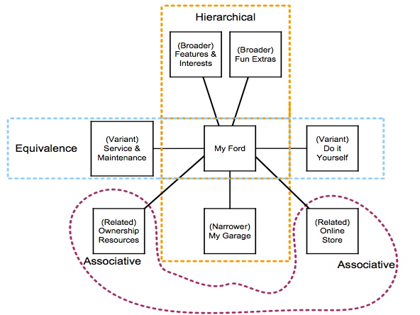
The Battle-Plan for the Consumer’s Mind: Global Navigation

I am thoroughly enjoying reading “Card Sorting” by Donna Spencer and any one who want to call themself an IA or UX person had better read it.  And it got me thinking about how I use card sorting in helping to construct global navigation.

That is why I want to share the above diagram. The above diagram is what I call a T-Based Classification System.   T-Based means Thesaurus based. It used the cards sort, but isn’t the direct result of a card sort.

I first learned about Thesuarui when I served as a guinea pig for Samantha Bailey. She was doing some guest lectures and then doing a workshop at a conference and was working out some in-class projects for people to understand about thesauri, synonym rings, and controlled vocabularies.  I was hooked from then on.

The thing I loved about it was that it was a coherent system.  And that is what you you see above.  A coherent system.  Not just a bunch of words or labels.  But a “WHOLE” a system that makes sense with internal logic (and hopefully external logic to the real world.)

The above was and is the basis for the global navigation for MY FORD, which is now, almost 10 years later “Ford Owners Garage.”  If you go to the site today the global navigation has recently changed (as users and the context has changed), but you can still see the skeleton of the concept. That it lasted almost 10 years I think is testiment to how well thought out the original idea was.

In meeting with clients I always like to talk about Information Architectures as “The Battle Plans for the Consumers Mind.” And as such I want it to make sense to the consumer.  I want a consumer to look at a global navigation and get a good sense of the scope or breath of what they can find in that site, of the offerings of that company, division, or brand.  If not – then I haven’t done my job.

That is why global navigation is key. It is the key symbol of a brand.  That is why a company’s online presence is so important.  That global navigation should have weeks and months of thinking behind it.  It is the key synthesizing symbol for the product, company, or brand that that website is telling the story of. (Side note: Key Symbols is a very useful concept that comes from “On Key Symbols” 1973 by Sherry Ortner, one of my top 10 favorite articles of all time.)

I hope you see that your global navigation should be a well crafted and deliberate strategy, or as I put it battle-plan for the consumer’s mind. I would like to invite you to try to take the last global navigation you worked on (or perhaps you are working on) and try to fit it into my T-based classification system. Most importantly it might help you see categories that are missing. At the least it will give you another way to validate your global navigation.

Lastly, if you’d like to try it and send the results to me I’ll gladly look it over and offer suggestions.

And yes, this is how to validate your global navigation in regards to Commandment #10 from my earlier post.

Good luck!

References

Sherry Ortner, “On Key Symbols,” American Anthropologist 75 (1973), pp. 1338- 1346

Sketching out Typographic Study for “First Blood” Movie Poster

Thursday, May 21st, 2009

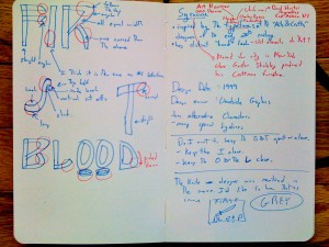
One of my project in a class I took was creating a movie poster.  I chose “First Blood” the 1982 action adventure movie with Sylvester Stallone as John Ramb, a Vietnam War veteran.img_07792 A great movie that harkens back to the Leatherstocking Tales of Natty Bumppo by American writer James Fenimore Cooper who wrote The Deerslayer and The Last of the Mohicans among others.

As you can see in the image I choose something inspired by the typefaces of the “Arts & Crafts” designers of the early 20th century. The Arts & Crafts movement tried to bring nature inside, into the home.  In the movie there is tension between the nature and civilized society represented by the town.  Rambo is of nature and he doesn’t seem to exist well “inside” society.Gustav Stickley produced his Craftman furniture in Syracuse New York.  This is near the area where the Leatherstocking Tales take place.  The contemporary type-house  who produces the typeface I choose is Woodside Graphics, which is located in the woods in the North West of the US.  That is very near the location where First Blood was filmed.

I like the “hand” look of the typeface which I think speaks to the way Rambo had to survive by things he made by hand, not with the fancy weapons those he fought against used. I like the bent wood look which speaks to the deep woods location the film. There are sharp aspects of the F that looked like two knife blades and Rambo’s most distinctive tool was a knife.

Grape Crepe Plates & Social Media as Kanban system for optimizing organizational flows of information needs

Monday, May 18th, 2009

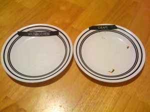
Tonight I made crepes for the kids.  Mom and away and so I figure this is a good time for me to experiment with some new dishes.  In the picture you can see two plates we used, a little dirty, that have labels that my one son printed out and attached to the top of the plates. img_07721 While I was busy making the crepes and giving them to the kids as fast as I could make them, they were eating them almost as fast.  My son would give me back the plate as they finished the crepes.  I would know exactly which kind they wanted more of. One plate was labled WUNBGCHESE and the other plate was labeled GRAPE. I made big cheese crepes and grape jelly crepes.  Beside the obvious work on spelling for ONE, BIG, and CHEESE,  I thought this is really ingenious.  It reminded me of the Just-in-time Kanban system. Wikipedia here and shorter/better article here.

Now, I have been doing a lot of thinking about social media and twitter and whether it is a push or pull type of system.  The crepe plates and kanban are both pull systems.  Inside of large organizations (like IBM) or an extended enterprises (like an Automotive Supply Chain) there might be a nice way to implement a “plate” that lets people know there is a needed update to certain kinds of information. Maybe social media mechanisms might be able to satisfy the 4 rules of implementing a pull system in terms of a Kanban system.

The 4 Rules are:

Rule 1 – Kanban works from upstream to downstream in the production process
My thought – So an report/answer would only be created when someone needs that information.  Reports that aren’t needed aren’t produced.

Rule 2 – The upstream processes only produce what has been withdrawn.
My thought – If information/reports are broken into appropriate levels of granularity – this might allow someone to only produce a update on those sections which were used/read/consumed.

Rule 3 – Only products that are 100 percent defect-free continue on through the production line.
My thought – Only reports/information that are “true” could go through. Quality and authenticity are the most important value.

Rule 4 – The number of kanban should be decreased over time.
My thought – The number of reports/information that gets worked on should be minimized over time because if something isn’t being used, it won’t get updated – reducing the breath of information following through organization but speeding up the smaller and more focused used kinds of information.

I guess I might call this “Social Media used as an Kanban system for optimizing organization flows of information needs.”

Visual Book notes for “Whatever you think, think the opposite” by Paul Arden

Thursday, May 14th, 2009

Whatever you think, think the opposite” by Paul Arden. He died just last month and at his website you can read many condolences and editorials.

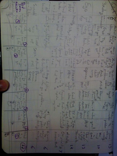
I think I take notes a little bit differently than other people. It seems to help me remember better.

In High School AP Biology class I took all my notes in a way similar to this and never had to study got an A and pretty much could recount word for word what the teacher said.

Now, with books like Arden’s I am not looking to get an A and there is no test.  My goal is to try to synthesize the book in a way so I can first understand it and then take action.

Below you can see my notes.  That is how I took them. The image is on it’s side. Along the bottom of the page you can see how I created a voting system, in which I wrote the most important idea from each column, then I did forced comparisons and decided between each adjoining pair, continuing that process until I came up with the most important idea from the entire book. Having it all on one page allows me to do decomposition and traceability through each of my decisions back to each individual idea from the book.  Kind of a gestalt view.

I don’t know if this would work for anyone else.  I would be most curious if anyone else out there takes notes in the manner.  It isn’t the Cornell Note Taking System, but it works for me.

In think also you can see the strong influence of a grid system. I have been talking alot with Todd Zaki Warfel of messagefirst fame about Grids and borrowing many grid books from his excellent library.

Choosing better expert participants for user research

Wednesday, May 13th, 2009

Needing Experts

Last Saturday down in Washington DC at redUXdc, Dave Cooksey gave a great presentation and part of his talk centered on cardsorting using Delphi techniques. Dave emphasized that the technique should be used with participants who are experts.

In his abbreviated talk Dave didn’t go into how to ensure that you have an expert participant for cardsorting. If the methods that you are using presume using expert users (or at least users with domain knowledge) then to increase the validity of your results you should try to qualify your participants.

Finding Experts

User Centered Design, UCD, is centered on users. But that shouldn’t mean any users, as much as possible it should be the right users, experts users in the domain you are investigating. UCD methods without users means almost nothing, with the wrong users you could think you are right, but with the wrong users.

We need to be better about finding or qualifying people who we test or research. Here are 3 simple tricks you might use to help select better participants.

  • Give them a short test of three  or five questions about the domain. It might be knowledge of certain financial terms for a 401K website, of certain garden pests for a seed website, or of Fast & Furious movie facts for a auto enthusiasts website. Only accept those with a certain number of right answers.  (It is even possible to do this without pre-determined “right” answers using cultural consensus modeling.)
  • Ask them to rate themselves on a scale of one to ten. If they rate themselves below a certain number they don’t recruit them. (A issue is confounding their expertise with their ability to self-evaluate.)
  • Ask them to recommend other people who they think are experts. Contact those people. (A very sophisticated method of doing this uses network analysis in which you contact those experts who are identified by numerous other people.)

In much of the work I have done I have always found the best investment of time and resources was in recruiting and screening (sometimes coming under the general method of sampling.) If you have really knowledgeable participants you can sometimes get by with less than stellar questions or inexperienced interviewers/researchers. But the reverse doesn’t seem to be true, even with the best questions and top-notch interviewers/researchers they can’t get the answers you need out of someone who doesn’t know them.  It would be like trying to squeeze blood from a stone. So spend your time (and your clients money) more wisely and put a little more effort into your selecting participants for your next cardsort or usability test.

Acknowledgements:
I want to thank Chris Farnum and Margaret Hanley for their help and encouragement.  Any errors in this post are, of course, my own.
Jared Spool & 1Billion$

Tuesday, May 12th, 2009

Jared Spool of UIE gave a nice talk at redUXdc last weekend. One thing that struck me was the the 1Billion$ idea. He talked about Amazon. And if they get people/customers to spend an extra 5$ a transaction that represents $875,000,000 top line growth. Very close to 1Billion$. That is my kind of math.

I’ll add a link to Jared’s presentation if I can find it online.

“Information Just Wants to be Free” – It’s not about the $

Monday, May 11th, 2009

Information Just Wants to be Free

Wikipedia has a good history of ways different people have used that expression, though not the way I am seeing it.

Maya Design & Viz did some excellent thinking around information and published a number of whitepapers around the turn of the century that still influence how I think about information. A key enabling concept is universal uniqueness of information.

“This uniqueness allows the development of tools that are information-centric, not document-centric — where information is trapped in or tightly bound by the software that created it. Freeing information allows software to be crafted that uses data in exactly the ways humans want.” – Viz

Wow – It’s not about the money. It is about free from a particular DB or software structure. It is about being free from the old structure, legacy systems, walled gardens, and being locked down. Free to be used beyond the DB structure.  This is way beyond the MVC architectural pattern and into Maya’s very cool concept of U-Form.  This is really cool stuff and has helped me the most in area of corporate dashboards and business intelligence applications that pull information from both internal operations and from “scanning” or “sensing” external data sources.